Thursday, September 22, 2011

Lady Saint's Styledelphia Part IX

Jess has asked me to create business cards for the company - now that opening is in a week! She has approved & is totally stoked with how they came out! After looking at that tarnished, yellowish paper on the bold red & tan background, I grew sick of it - too fast. So i re directed the whole idea. Keeping it the same, but updating it, to a cleaner & softer touch. After all, this is a MAKEUP & STYLE academy! I LOVE how they came out & can't wait for them to be printed!!


Wednesday, September 21, 2011

Lady Saint's Styledelphia Part VIII

Here goes WEEK 2 of the philadelphia paper ad's! This week was posted in the Philadelphia Weekly! The AD came out BEAUTIFUL! Nice & bright, as compared to the week before. HOWEVER, there is ONE THING that is TERRIBLE! I blame it 1000% on myself, as I was re-writing the copy to fit. THERE IS A SPELLING ERROR!! :( I caught it, the DAY that it was sent out for print! I tried so very had to get them to take the new version, but it was all too late. Moral of the story, ALWAYS CHECK , DOUBLE & TRIPLE CHECK YOUR WORK!! And to show it to someone to proof read!!! It was a VERY important lesson, and it will NEVER HAPPEN AGAIN!! sheesh!!!


The computer version


The Philadelphia Weekly version

Thursday, September 15, 2011

Lady Saint's Styledelphia Part VII

TODAY, I WAS PUBLISHED! haha! Well, I wouldn't go THAT far, BUT for the very first time, MY DESIGN was printed in a city wide news paper! It's a pretty big deal for a small time freelance designer such as myself! I could not be more thrilled!!!
The Computer Version

The City Paper Version

The images from the actual printed version are a TAD too dark for my liking. So i'll remember for 2 weeks from now, to brighten it up a bit! It feels really insane, to see something that I did printed in a paper. As you can tell, i am VERY EASILY entertained :)

Monday, September 5, 2011

Lady Saint's Styledelphia Part VI

The full, complete website is now LIVE!! We made it live last night, in honor of our PHILADELPHIA WEEKLY AD's & CITY PAPER AD's that will be in papers NEXT WEEK! We could not be more thrilled with how smooth & clean the site is! I am a designer who is always very hard on myself, and believe that a design is never finished - I love this site, but feel as if there could be lot's more added to it, design wise. This will definitely do for now! Visit www.styledelphia.com to see the full, working site. Here are a few screen shots to give you the design aesthetic we went with!

Home Page


About Us Page


Classes Page


Classes Page - Purchase Section


Contact Page


Gallery Page


Gallery with a photo expanded


Staff Page


Staff Page with a photo expanded

Monday, August 22, 2011

Lady Saint's Styledelphia Part V

Jessica Saint, the owner of Lady Saint's Styledelphia has decided to have me create flyers to announce the Opening of Styledelphia in October 2011. We have printed 5000 flyers & they came out BEAUTIFUL! Thanks to www.rushflyers.com. If you need ANYTHING printed at all, I would strongly suggest printing through them!

The Front of the Flyer

The Back of the Flyer

Tuesday, July 26, 2011

Lady Saint's Styledelphia Part IV

I am PROUD to announce that we have finally made www.styledelphia.com LIVE!!

Here is a screenshot of the final splash page! I am still working on the layout/visuals of the rest of the site. If anything, this spalsh page is a great teaser!!


What do you think?!

Saturday, July 23, 2011

Metals typeface for Feist

Well well well... here I go again, taking on yet another freelance job! This time - it's a HUGE job. Thankfully it didnt take a long time, about a day's work. Keep in mind, it's going to look ridiculous on my resume. Having helped with the art on grammy award winning artist's Feist's new album is priceless.

Her artists have created a font out of cut paper. My job was to take the scanned in cut paper and make it into a working typeface. They also provided numbers and select punctuation's.

Below are the final characters. It took about 10 hours to complete it. I could not be more excited to have helped! What a great opportunity!!

Tuesday, July 19, 2011

Jackie & Kurt's Wedding!

My lovely cousin, Jackie recently got married to Kurt Miller on June 5, 2011

I brought my camera with me, and was determined to take beautiful photos. I took about 215photos and an amazing 100+ came out! Here are a few of my favorite photos


This is the link that will bring you to my gallery that I made for the family.
Jackie & Kurt's Wedding Photos

I hope you enjoy!

Wednesday, July 6, 2011

She Came Crashing Part II


Mentioned in my last post, I made the She Came Crashing logo look not only like a gold necklace with a chain, but I also made it have some bling! I also took the gold chain necklace and did some comps with a grenade pattern background. Louis Vuitton inspired me for these images. Low gradient, low pattern but lot's of POP! It could very well be the beginning concept of their band website... hhmm. Lightbulb!


Sunday, July 3, 2011

She Came Crashing Part I


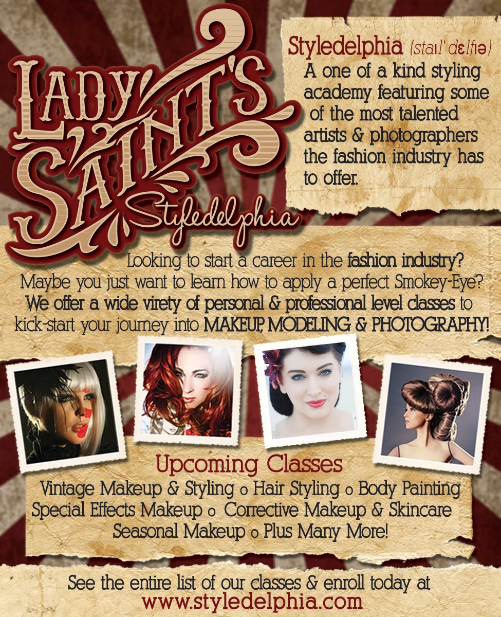
Well it happened! I was in the middle of designing stuff for my Styledelphia project, and I came across a font that WORKS! Below I have the original font that I saw - and what I did with it. Amanda kept saying how she like's a clean look, but also likes abstract stuff too. I never thought that I'd be able to bring those 2 components together, but I did!


Notice in the photo below, it's just the raw font face that I found - and loved. The S & C connect so beautifully, that made me feel as if the whole thing can become one element. Therefore it became this weird abstract logo. I love it! & so do they!

I have a crazy idea to make this look like a gold necklace - perhaps add 'bling' to it. Josh, my boyfriend recently took band photo's of amanda - she had gold necklaces and bracelets, kinda having an urban feel to it. So i think that's the direction that i want to take it.

My design aesthetic is anything but urban. So this will be an interesting challenge for me. It's pushing me out of my comfort zone as a designer, but I like that. It's PUSHING me. Oh and as an added note, she just told me that her and ray enjoy things such as grenades, bombs, guns, bullets etc... They ARE very peaceful people, but simply enjoy that kinda thing. Sounds like I have my work cut out for me :)

SHE CAME CRASHING
Photography by JoshBender

Saturday, June 25, 2011

She Came Crashing

I was just asked to do a band identity for friend's of my boyfriend and I! They are a brother/sister band - she, a trained opera singer. He - a master of mixing, and composing music. Together they create beautiful, abstract music. They asked me to design the band logo and website for them. Eventually merchandise, posters t-shirts etc... I sat down with Amanda and picked her brain a little bit about what both her and Ray like. We looked at a few band pages, logo's and such. I have a general idea as to where to take this. Hopefully I'll see something that will make a light bulb go off in my head. More post's to come!

Friday, June 17, 2011

Lady Saint's Styledelphia Part III


We FINALIZED the logo design!! I added the woodcut/layered look that I had mentioned in the previous post. I originally had it as the red, white & blue idea - but showing it to a friend, they said it looked like a sport's logo. um, not what i was going for!

So I had to re-direct the color scheme. After picking Jess' brain, she mentioned that she really loves old circus posters, so I went with a color concept choosing brown, red and tan.

Let me know what you think! Which do you like more?

Friday, May 27, 2011

Lady Saint's Styledelphia Part II


We finalized a logo idea today! I am so excited as to how it was one of my first ideas, it was fun and simple to start. Every other idea after this one just didn't feel right. That's how you know this is THE ONE! Jess even went to the extent of saying "you know when your looking for that perfect wedding dress, and they say you know when it's THE ONE?! WELL... THIS IS THE ONE!!"

A client saying something like that to me made me feel amazing! I did what was expected, and more! I shall continue with this rough idea and continue on! I think since we are going for a vintage look/feel, i want to make it look like a wood cut, layered and shadowed. Still in the brainstorming process style wise. but at least we have a general look! YAY!!

Another concept, that ALMOST won...

Thursday, May 5, 2011

Lady Saint's Styledelphia!

I recently landed a HUGE freelance design job. A friend of mine, Jessica Saint - who is an amazing make-up artist, model and burlesque dancer, decided to open her very own make-up & styling school! She hired me to be her graphic designer to design her identity. Logo, business cards, flyers, website and advertisements! I could not be more thrilled! There are still lot's of details to work out with the company, so I am going to begin the logo, to lay out the rest of the look & feel of the company. I believe that we are going to go a vintage/western/circus/pin-up route. If that makes any sense. haha. I will continue to post updated logos. I couldn't be more thrilled to be apart of her team! Not only am I designing for her, she also wants me to model for them as well! how much could a girl ask for?!

Wednesday, April 27, 2011

Fairyland Poster Series!

SInce my last inspiration post, about Saul Bass, I have been all about simplified design. There's something about being able to take an idea, and deconstruct it with little to no detail, and maybe use 2-3 colors. I have been offered to design a series of Movie posters for a friend of mine that is going to be doing a short called "Fairyland". I have read the script, it is super clever. He had a few ideas as to what the poster should look like, so I took it and ran with it. I channeled my inner saul bass, and needless to say, I am beyond thrilled with the final product. I have never ventured into this realm of design before, it feels rather natural, almost too natural. Maybe this is the direction that I am headed for my re-identifying myself, as I have mentioned in my earlier post.

Here are 2 final posters so far. I am working on a 3rd, and will be posting it soon!


Tuesday, April 26, 2011

A nod to Roy Lichtenstein

Here I go again, messing around... This time, I took a photo of a good friend of mine, and did a little illustrator/photoshop work to it, inspired by Sir Roy Lichtenstein.


Model : Zui
Photographer: joshbender

Monday, April 25, 2011

A Whole New "ME"

The spring is most defiantly a time for growth, and rebirth. I have been trying to re-define myself as a graphic designer. In efforts of the continued graphic design job hunt, I am going to be re-working my website/identity to fit my personality better. Don't get me wrong, I love love love my last site, but my aesthetic changes so frequently, that it's not "ME" any longer. Stay tuned for a whole new "ME" identity!!!

Wednesday, April 20, 2011

Happy Easter!

It's yet another holiday, time for more inspiration! The flowers are in bloom, pastel colors, the spring breeze, and finally some beautiful weather! I decided to do an easter greeting card cover for fun. Here is what it came to be!

Thursday, April 14, 2011

Inspiration vol.3 Saul Bass


Saul Bass is everywhere. He is the definition of a graphic designer. When I explain to people what graphic design is, I describe it as everything that you see, packages, logos, signs, posters. everything. That simple logo you see everyday was once someone's brain child. It had to come from from somewhere. Weather it was a group of 20 people, or the thought process of 1 person. Saul Bass as been around for years. This man has created hundreds of well recognized logos, movie posters, branding, everything. He is a one man 'brand' when it comes to his work.

He's an inspiration solely based on his work ethic. Like I said, He has done hundreds of things that have stuck around for years and years. Which means that its so good that no one has had to re design most of his work to update it. His work is timeless, clean, and flawless.


Saturday, April 2, 2011

Spring, Sprang, Sprung!

Last night and today, I walked around my lovely neighborhood, and took my new best friend, my camera with me! I captured some awesome photos, I thought I would share!